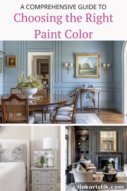
Choosing the right paint color for a room can feel overwhelming. This guide breaks the process into clear, practical steps so you can pick a color you’ll love every time.
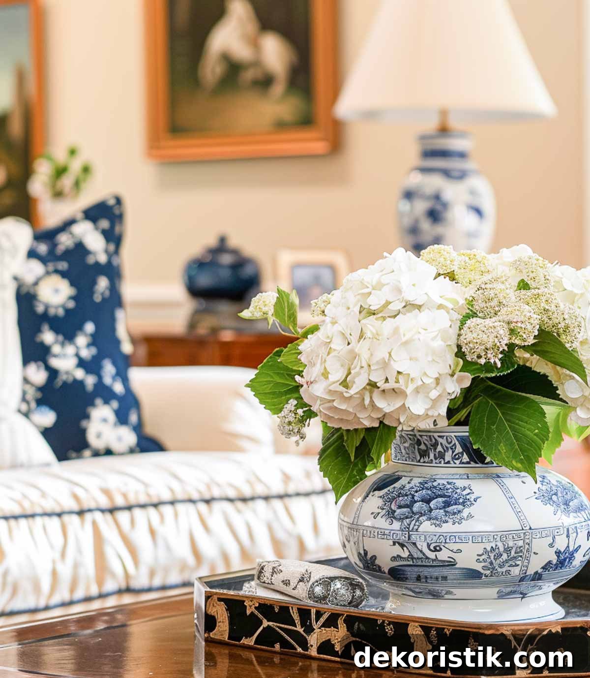
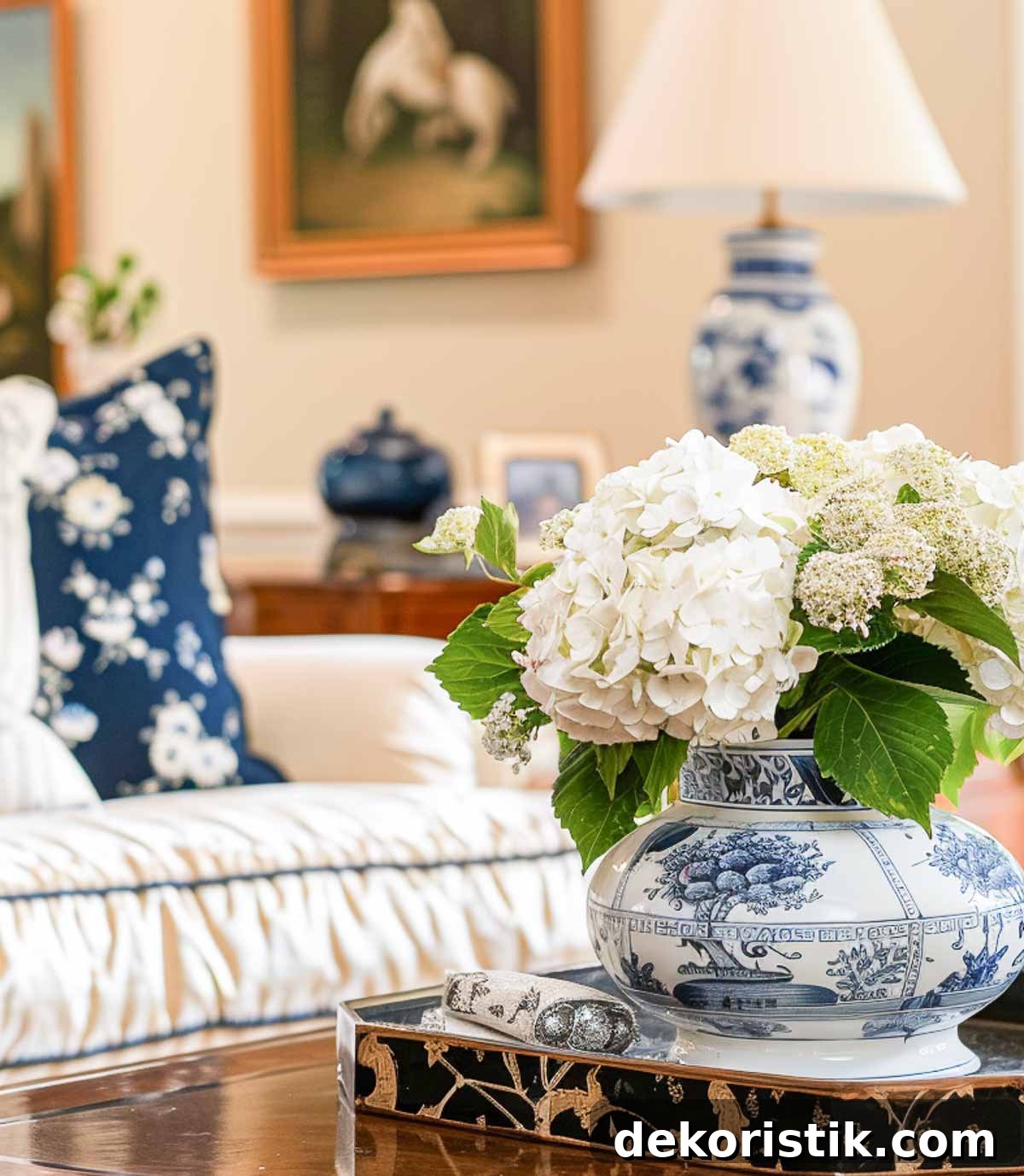
When researching this topic I discovered why so many people struggle with color: there are many factors to consider—light, undertones, furnishings, and how you want the room to feel. With a few straightforward principles you can remove the guesswork and make confident choices.
Welcome to Chapter 4 of the Simply Decorating Series, a free resource for the DIY decorator who wants to transform their home. Each post simplifies design ideas into practical steps. If you’re new to the series, begin with Chapter 1, How to Decorate a Room – Where To Start.
I’ve organized the process of choosing paint into manageable steps so you can avoid common mistakes and choose a color that looks great in your space.
I’ve made my fair share of color mistakes. I once painted a nursery a “precious pink” that read like a bottle of Pepto on the walls. Another time I aimed for a sunny kitchen and ended up with a yellow that felt like a giant egg had exploded across the room. And choosing a beige straight from a chip without accounting for undertones and lighting left the same room looking like different desserts throughout the day—each light condition shifted the tone dramatically.
You’re not alone. Even experienced designers misjudge color sometimes. The good news is that most color issues are avoidable if you understand a few basics and take time to test your choices.
TIP: Try the color quiz at the end of this post to help you start narrowing down options.
If you’ve ever stood in a paint store overwhelmed by thousands of color chips, or regretted a wall color after painting, this guide will help you choose wisely.

Are you redecorating or refreshing?
First decide whether you’re keeping your existing furnishings or fully redecorating. That decision changes how you choose a paint color.
- Not redecorating: Your paint must harmonize with the current furniture, rugs, artwork, and finishes. Prioritize colors that complement what stays in the room.
- Redecorating: You have more freedom to choose bold or entirely new color directions because you can select furnishings and finishes to match the paint, not the other way around.
TIP: When redecorating, pick the final wall color after choosing furniture, fabrics, and accessories. It’s easier to choose paint to match new pieces than the reverse.
Analyze the room
Before you pick a color, study the room carefully. Ask yourself:
- What is the room used for? Function influences mood and color choices.
- How much natural light does it receive, and from which direction? North-facing rooms often benefit from warmer tones to counter cool daylight.
- What type of artificial lighting is used? Overhead cool-white lights can make colors feel harsh; warm bulbs can soften them.
- Does the wall surface have imperfections? Texture affects how sheen and color read.
- Is the room small or large? Do you want it to feel larger or more intimate?
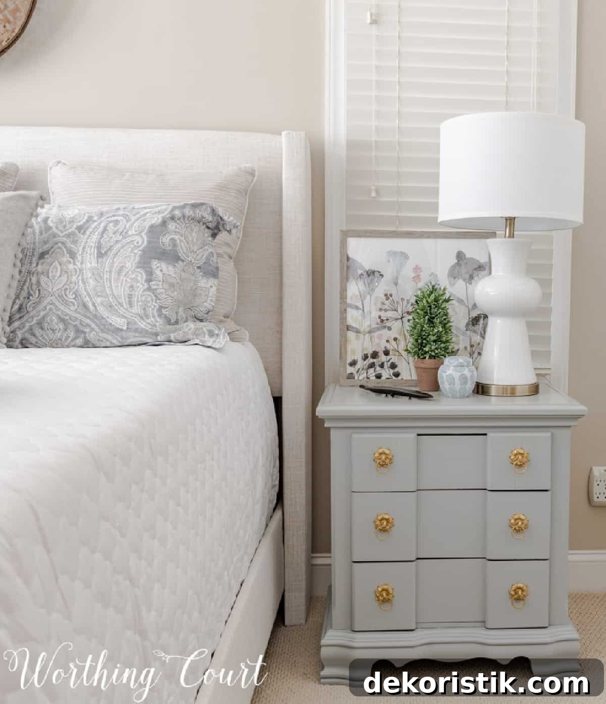
Learn a little color theory
You don’t need a degree in design, but a basic understanding of color psychology and coordination helps you choose colors that look and feel right.
Here are common emotional associations to guide room selection:
- White: Clean and bright, though it can feel cold.
- Gray: Modern and calming.
- Beige: Warm and cozy.
- Red: Energetic and passionate.
- Blue: Calming and soothing.
- Yellow: Cheerful and warm.
- Green: Refreshing—combines yellow’s cheer with blue’s calm.
- Orange: Vibrant and lively.
- Purple: Luxurious and sophisticated.
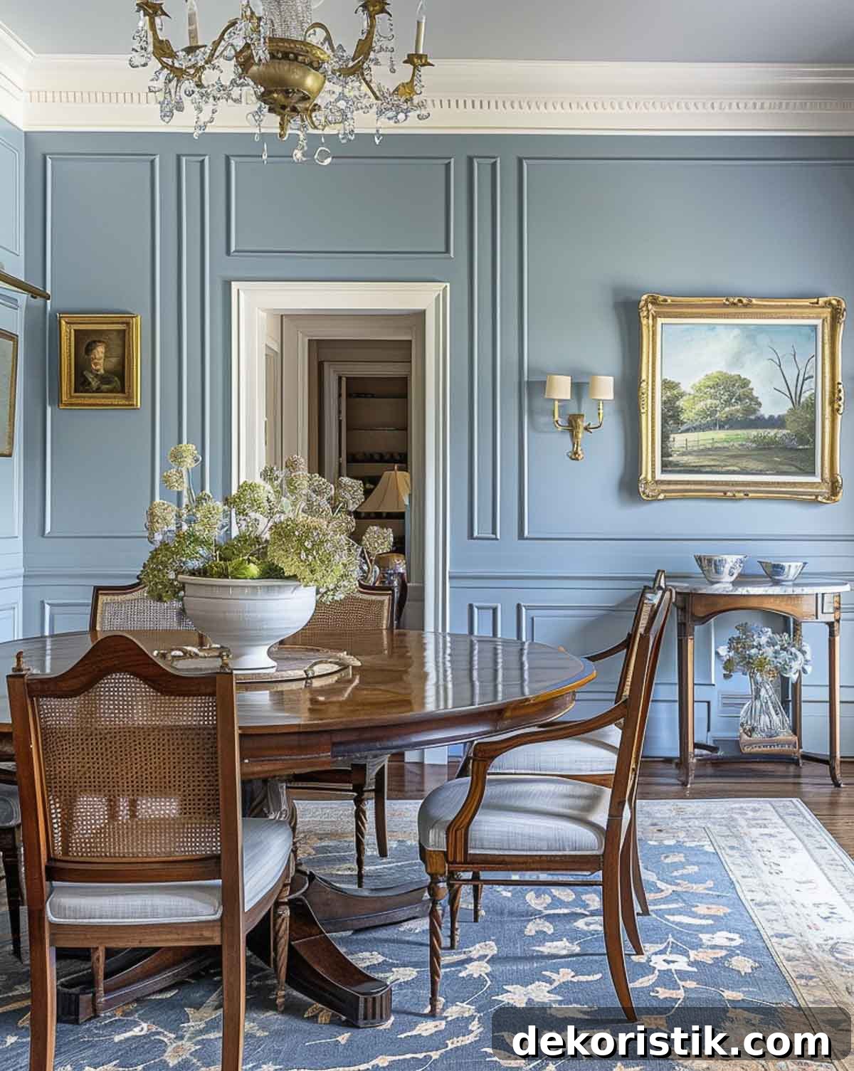
Color psychology is useful when assigning colors to rooms—blue for relaxation in bedrooms, green or yellow for lively family spaces, and so on. To coordinate colors between rooms, use a color wheel: complementary colors (opposites) create contrast and energy; adjacent colors produce harmony and cohesion.
Test colors
After narrowing options in the store, take several paint chips home. Choose a range of shades and different undertones within the same color family—subtle undertones can change the feel dramatically once applied to a wall.
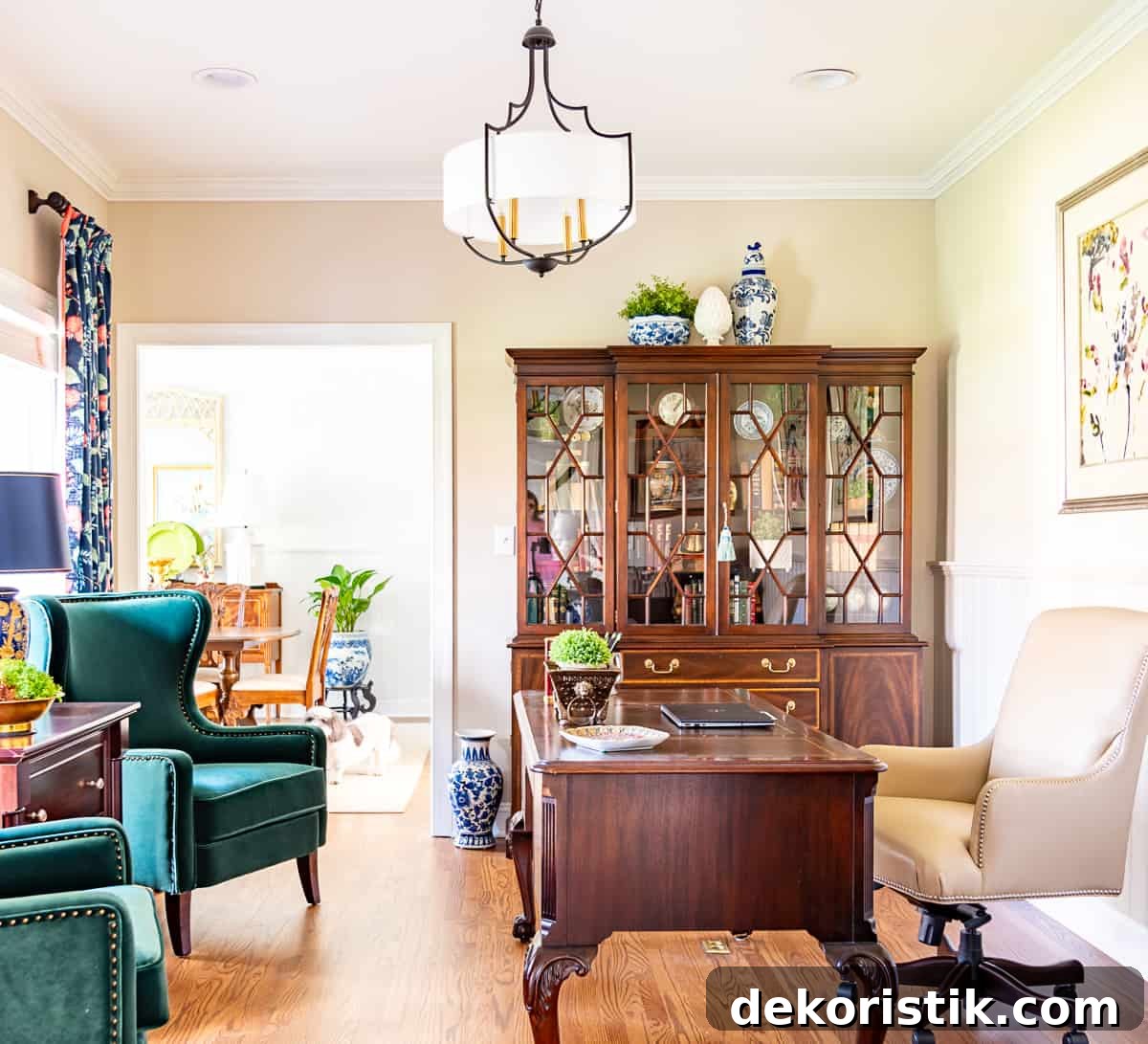
Never choose a final color from a single chip. Hold chips against furniture, art, and different walls at various times of day to see how light and surrounding colors influence them. If you’re redecorating, work from your mood board and inspiration pieces when comparing chips.
Buy sample pots of the most promising colors. You have two practical ways to test them:
- Paint a large section on each wall with two coats. This shows how the color looks at different angles and under varied light.
- Paint two coats on a foam-core poster board and move it around the room to observe changes with light and furnishings.
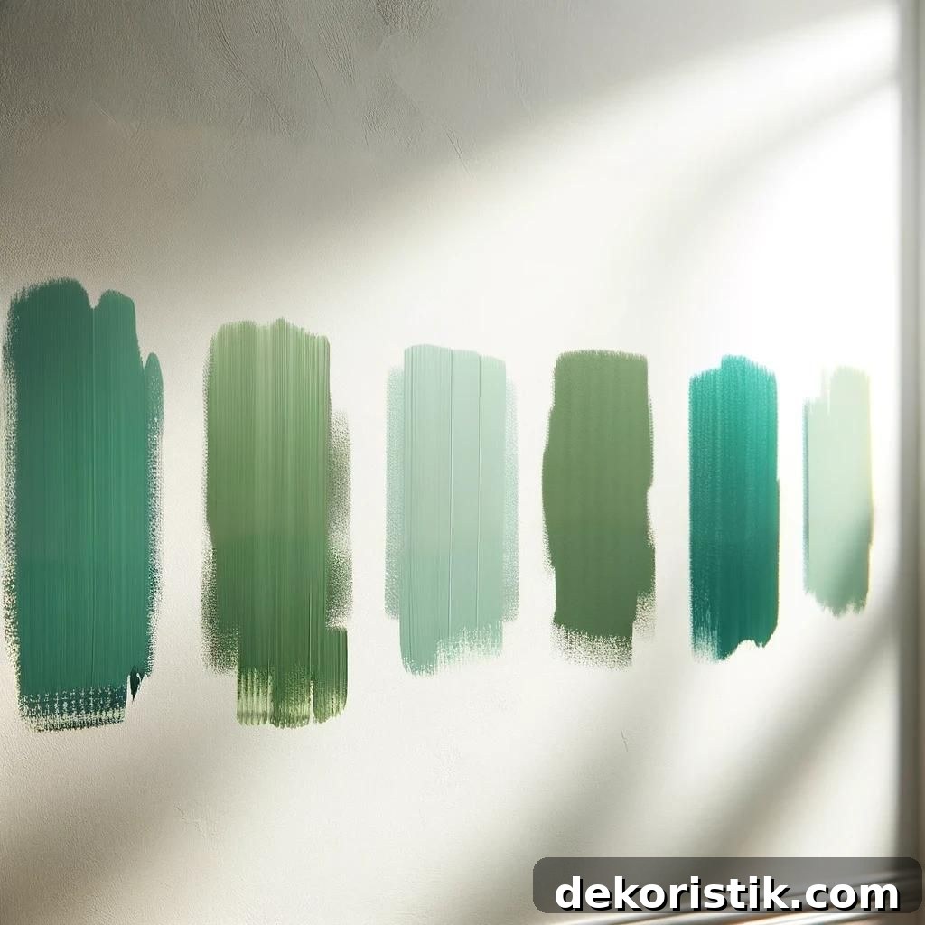
Some stores sell peel-and-stick samples that are large enough to evaluate color in place—these can be convenient for visualizing the paint at different times of day and against furniture.
Choose the correct sheen
The paint sheen affects both appearance and durability. Look at the same color in different sheens before deciding.

- Flat/Matte: Subtle and forgiving of imperfections; ideal for living rooms and bedrooms but harder to clean.
- Satin/Eggshell/Semi-gloss: Soft sheen with better cleanability—good for most living spaces.
- Gloss: Very durable and easy to clean; commonly used for trim, doors, and high-traffic areas.
- Lacquer/High-gloss: Extremely shiny and durable; used for dramatic, modern looks on walls or furniture.
If trim and walls are the same color, many people use a slightly glossier finish on trim to help it stand up to handling and cleaning. TIP: For removing scuffs from painted walls, a damp Mr. Clean Magic Eraser works well.
Light vs dark paint colors
Dark walls tend to make a room feel smaller and cozier, while light walls create a sense of openness. But there are more nuances to consider.
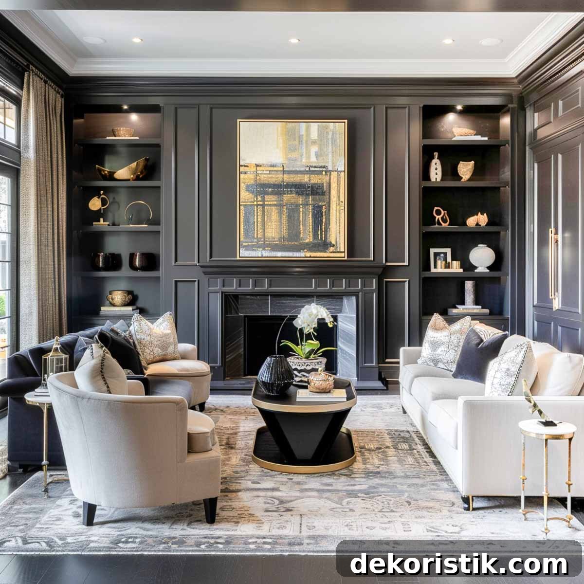
Dark colors: create mood and drama, hide imperfections and stains, alter perceived temperature, and provide a striking backdrop for artwork and furnishings.
Light colors: add airiness, create a neutral backdrop that suits many styles, promote calm and resale appeal, and tend to show dirt more readily.
Commonly asked questions
Why does my paint color look different on the wall?
A color that looks perfect on a small swatch may change once painted on a wall because:
- Lighting: Natural and artificial light alter how colors read.
- Surroundings: Nearby colors reflect onto the walls and change perception.
- Surface: Texture and wall condition affect how light interacts with the paint.
- Undertones: Subtle undertones can become more apparent at scale and under certain lighting.
How do you transition colors from room to room?
Pay attention to sight lines between rooms. Choose colors that harmonize when seen together; subtle shifts in tone create flow without becoming monotonous. Use the color wheel: adjacent hues create unity, complementary hues add intentional contrast.
Does paint appear lighter or darker when it dries?
Paint often looks slightly darker once it dries because the wet sheen changes as moisture evaporates. The degree of change varies by paint type, color, and surface.
How many coats of paint will my walls need?
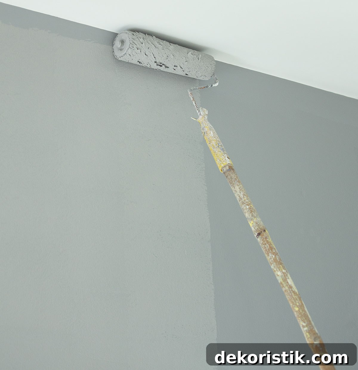
Most projects require two top coats for even coverage and color depth. Using a primer on new or drastically different underlying colors often improves coverage and may reduce the number of top coats needed.
What color should I paint the ceiling?
Standard “ceiling white” is a flat, neutral white that helps ceilings read brighter and higher. For a designer look, paint the ceiling the same color as the walls to create a cohesive “fifth wall,” and consider painting trim the same color for a seamless effect.
Do’s and don’ts
DON’T
- Don’t overwhelm a room with too many competing wall colors.
- Don’t ignore the emotional impact of color.
- Don’t forget sight lines and overall home flow.
- Don’t rush—take time with samples before committing.
- Don’t chase every color trend for permanent wall color.
DO
- Limit bold choices to one accent wall at most.
- Refer to color theory when coordinating palettes.
- Use a cohesive color palette throughout connected spaces.
- Live with samples for several days to observe them in changing light.
- Choose timeless wall colors and add trends with accessories and textiles.
Take the color quiz
Use the printable quiz to help identify which color palette suits you best. Answer thoughtfully and review your results to find the styles and hues that match your preferences and lifestyle.
Choosing the right paint color doesn’t have to be stressful. With the steps above—analyzing the room, understanding color basics, testing samples, and picking an appropriate sheen—you can confidently select a color that enhances your home’s mood and function.
Happy painting, and may your home reflect the comfort and style you envision.