
The dining area in our beach condo is a compact space that doubles as the main entry and the passage from the kitchen to the rest of the home. It’s the first thing you see when you walk in, so making a good first impression was important to me.
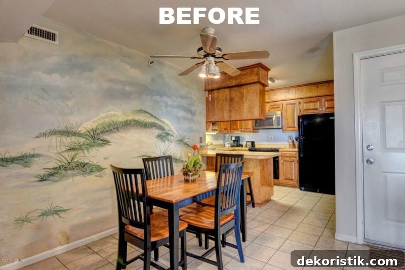
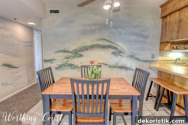
To show how far the room came, here are the original listing photos of the condo. The layout felt awkward and the decor read as generic “beach rental chic.” Aside from a cracked tile, the room was in solid condition, but it didn’t reflect my style. In many coastal real estate sales, furniture and accessories are included, so I was able to reuse some pieces during the refresh.
After deciding which furniture to keep and how the space needed to function, I created a mood board and a clear to-do list. The overall direction for the condo is modern farmhouse with a subtle beach influence. Below I list paint colors and the resources for pieces used in this makeover. If you enjoy using a mood board for decorating, it can be a simple way to pull a look together.
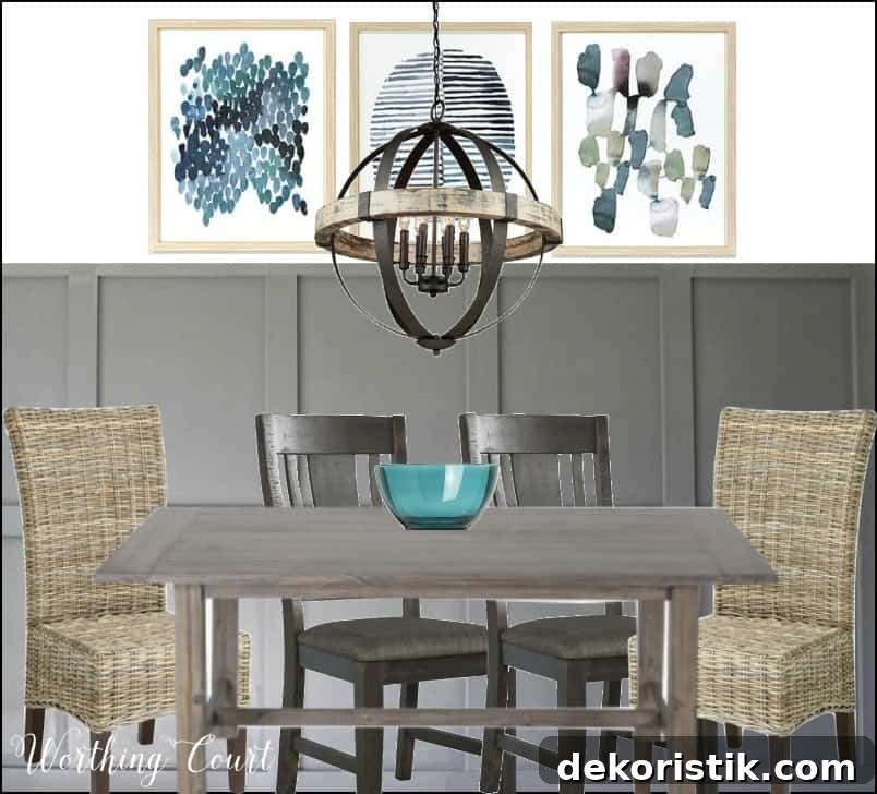
MY TO-DO LIST:
- Remove murals and paint all surfaces: walls, trim and ceiling
- Replace tile with laminate flooring
- Add board and batten on the wall behind the table
- Paint the board and batten a mid-tone gray
- Replace the ceiling fan with a statement chandelier
- Buy a larger dining table to seat six comfortably
- Add end chairs that have a subtle beach vibe
- Refresh existing side chairs and barstools with paint
- Add a small chest in the entry area for keys and essentials
- Add an area rug to unify the space
- Choose artwork and accessories to complete the look
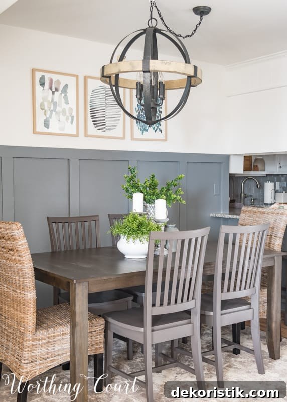
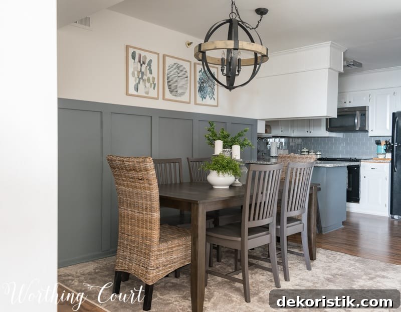
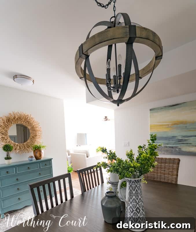
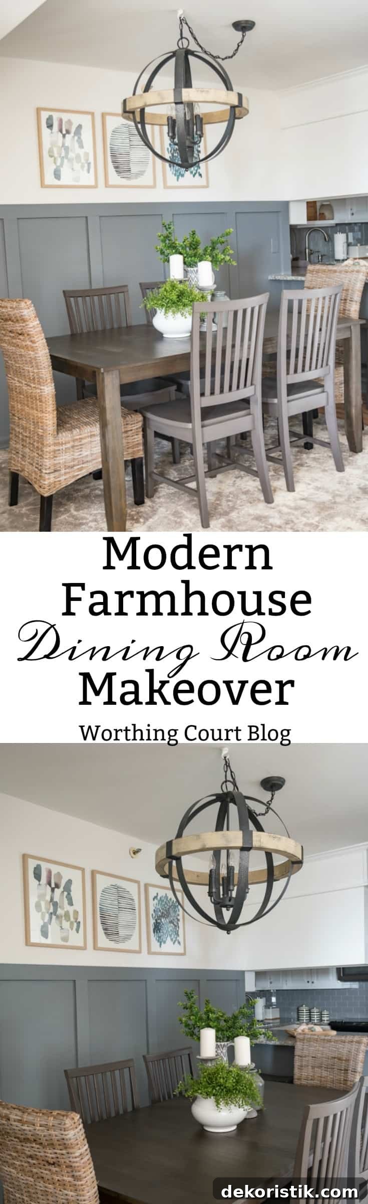
One item became the inspiration for the whole room: a striking chandelier. I fell for an orb-style chandelier that felt both rustic and modern, and I decided to make it the focal point. You might remember it from a mid-makeover update I shared earlier. Its scale and light output ultimately guided many of the other design choices.

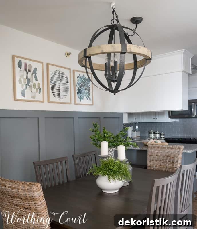
A few installation notes:
- The chandelier I chose is larger than what I would typically hang over a small table, but the smaller version didn’t provide sufficient ambient light. In this compact entry/dining hybrid, the fixture needed to illuminate the whole area, not just the tabletop.
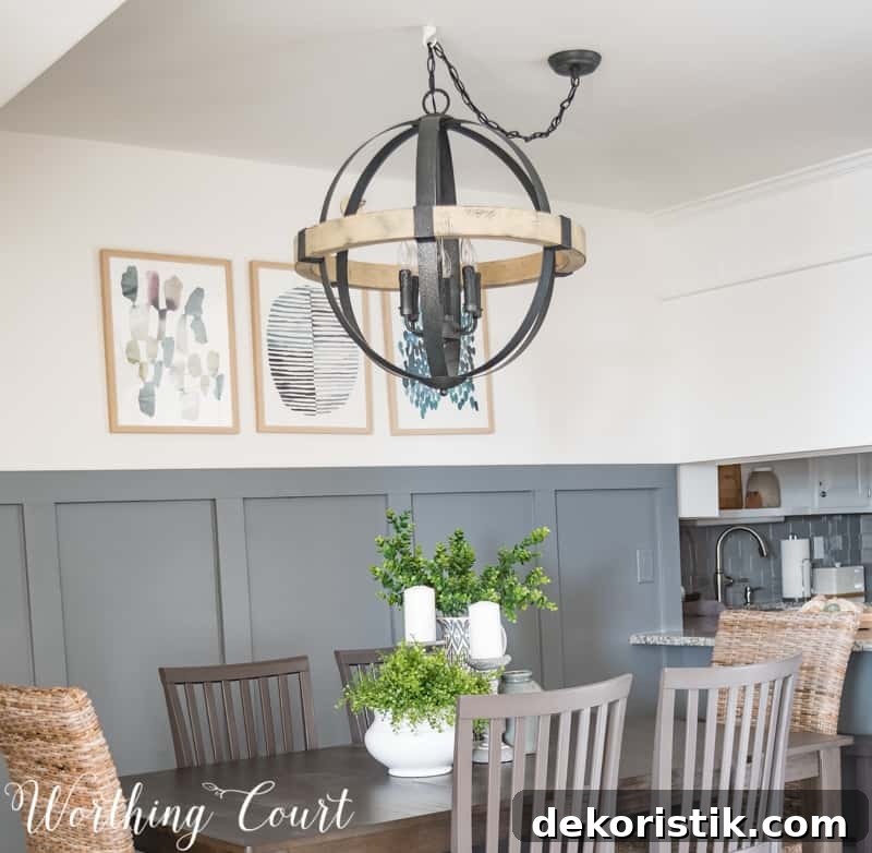
- The fixture is also mounted slightly higher than usual above the table for better light distribution across the space. The six candelabra bulbs brighten the room beautifully and make the whole area feel inviting.
The beach murals on two walls were removable wallpaper and came off easily. After removing them, a light sanding removed any residual paste. Once the murals were gone, the wall beside the table felt too bare. Because that wall is right next to the chairs and easily bumped, a gallery wall or heavy artwork wouldn’t work well. Adding board and batten created visual interest and added architectural depth without crowding the seating.
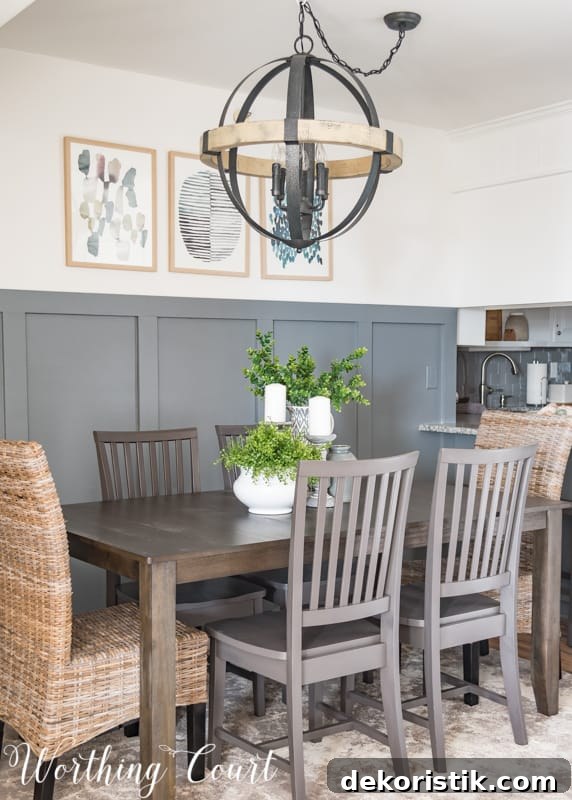
We matched the board-and-batten height to the bottom of the kitchen cabinets so it feels integrated with the adjoining space. I painted it a medium gray that anchors the room, and a trio of abstract prints above the paneling introduces my blue accent color in a subtle, modern way.
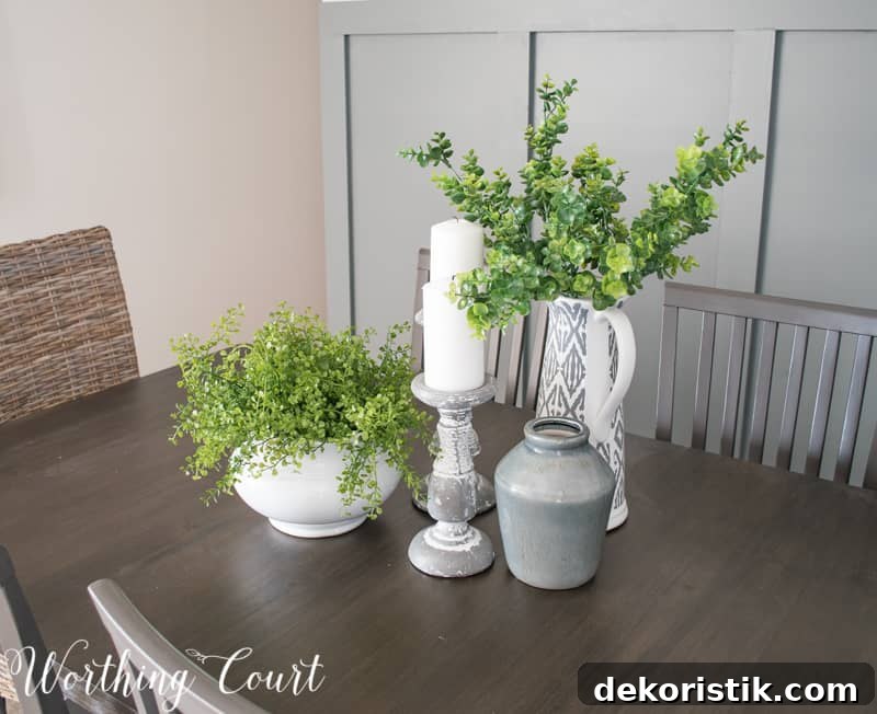
I considered keeping the original dining table, but it only seated four comfortably and I wanted seating for six. An expanding table felt unnecessary, so I found an affordable, sturdy table with a warm finish that has just a hint of gray in the wood tone. I refreshed four existing chairs and two barstools with a favorite gray spray paint to unify the palette. At each end of the table I placed wicker armchairs that help bridge the gray and brown tones while adding a coastal texture.
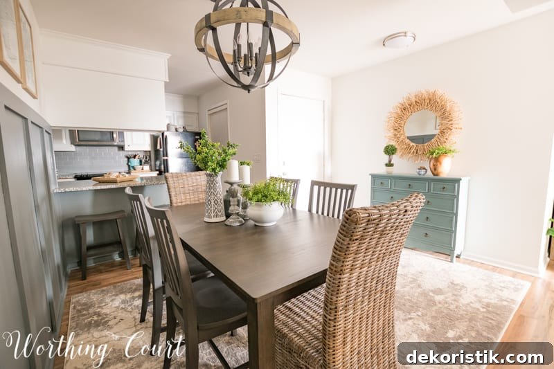
In the entry portion of the space I added a narrow blue chest opposite the table. It holds keys, leashes and other essentials and keeps clutter out of sight. I paired it with a twig-style round mirror that evokes driftwood and beach finds—an element my dog thought was funny at first, but I love how it anchors the entry.
Another blank wall runs along the pass-through to the hallway opposite the front door. Normally I don’t feel every wall needs decoration, but this one required something to prevent the area from feeling unfinished. A large abstract painting with water-and-sky tones fits the modern farmhouse aesthetic and helps define that transition zone.
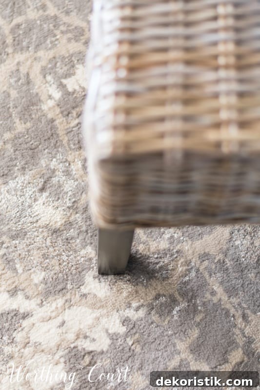
To complete the room, I introduced a rug in ivory, gray and taupe that ties the seating area and entry together. My original plan was to place a rug only under the table, but that would have interfered with the walkway and the door mat. Using an 8′ x 10′ rug turned sideways allowed it to function both as a dining rug and as an entrance mat. Turning the rug solved the layout challenge and visually grounded the entire area.
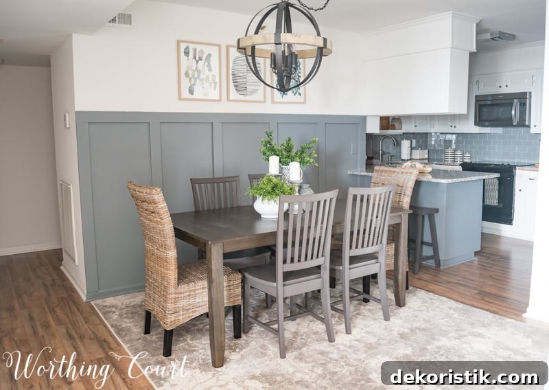
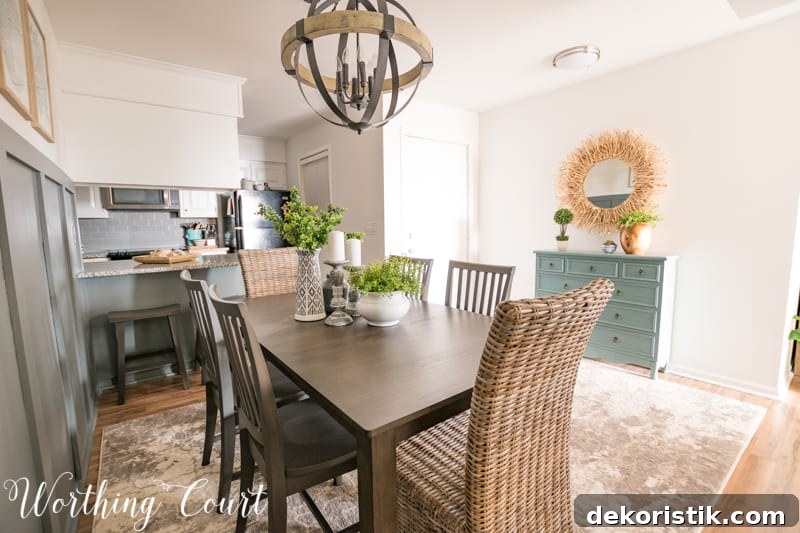
So, did the mood board come to life? I’d say yes—the space now reads as cohesive, functional, and welcoming. The architectural detail, the bold light fixture, the layered neutrals and the coastal accents work together to create a small dining room that feels much larger and more intentional.

RESOURCES AND PAINT COLORS:
Some affiliate links were used; see the blog’s disclosure for details.
Paint (Sherwin Williams): walls – Snowbound; ceiling – Ceiling White; trim – Extra White; board and batten wall – Wall Street
Flooring: Lowe’s (laminate)
Chair and barstool paint: Rust-Oleum Anodized Bronze spray paint
Chandelier: orb-style rustic chandelier
Table: Signature Design by Ashley or comparable sturdy dining table with warm gray-brown finish
Wicker dining chairs: similar styles available from national retailers
Area rug: ivory, gray and taupe palette (8′ x 10′ recommended for this layout)
Blue chest: small entry console in a coastal blue finish
Round twig mirror: driftwood-inspired round mirror
Teak wood vase, abstract watercolor trio, large square abstract art and accent vases: selected from home decor retailers to complement the modern farmhouse palette
Chairs and barstools were left by the previous owner and were refreshed with paint to coordinate with the new table.