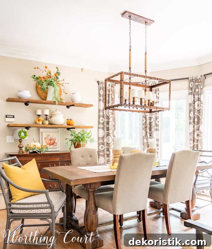
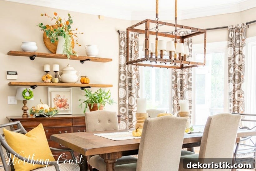
Beautiful, yet simple shelf decor to inspire you as you decorate your own home for fall.
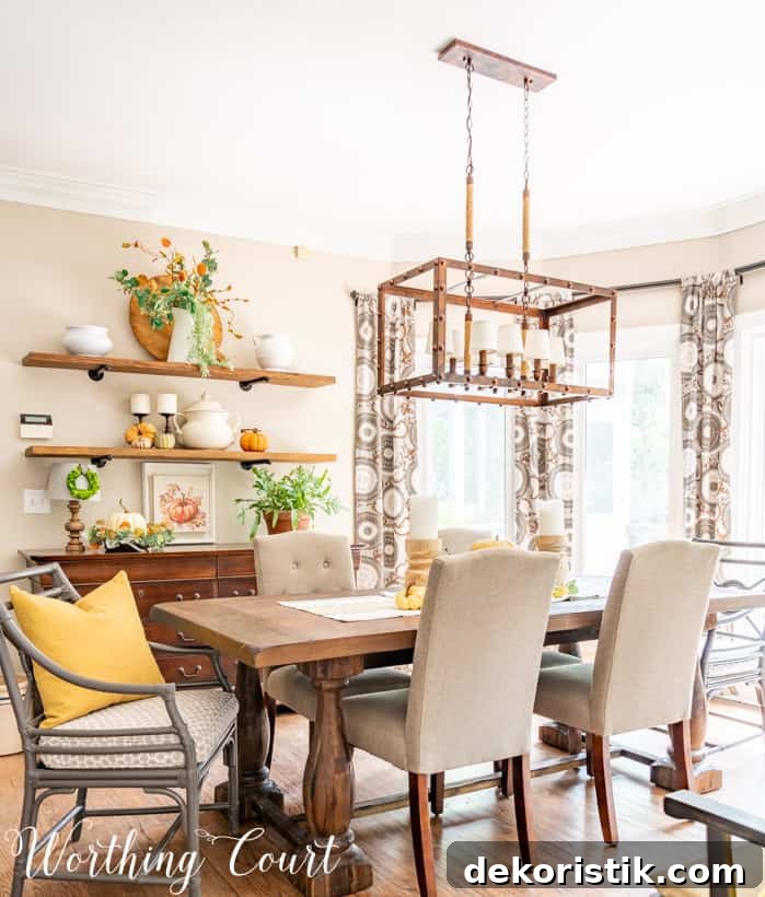
Fall Shelf Decor to Inspire Your Home
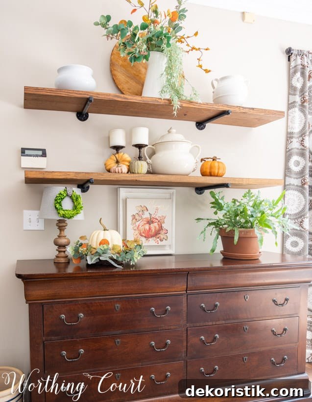
Do you have shelves, bookcases, or display ledges in your home? Adding fall shelf decor is an easy way to bring seasonal warmth and charm into everyday spaces. Whether you create a full vignette or simply add a few seasonal accents, a thoughtful grouping can instantly change the mood of a room. The shelves in my breakfast area become a focal point every season, and this year I focused on keeping the look simple and layered with muted autumn tones.
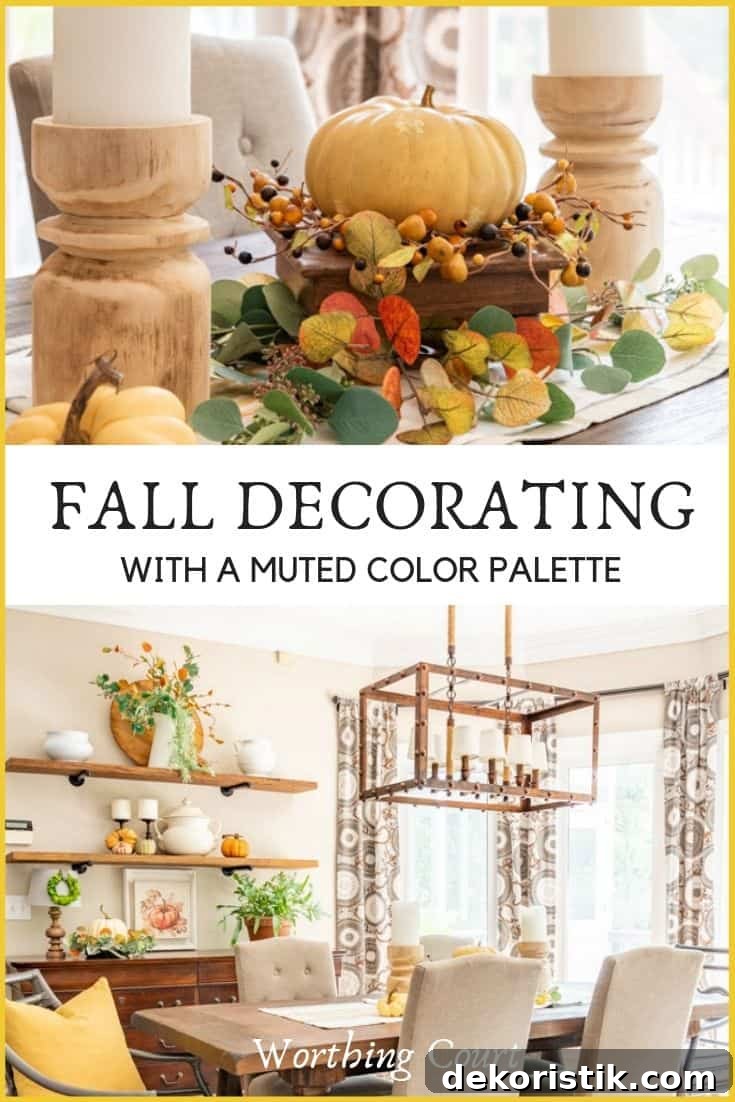
Each season I try to refresh the shelves with something a little different, and for this fall I settled on two guiding ideas: simplicity and a toned-down color palette. I avoided bright orange and instead used sagey eucalyptus greens, rustic burnt orange, and touches of warm mustard gold. The result is cozy and calm—autumnal without feeling loud.
How I Styled the Shelves
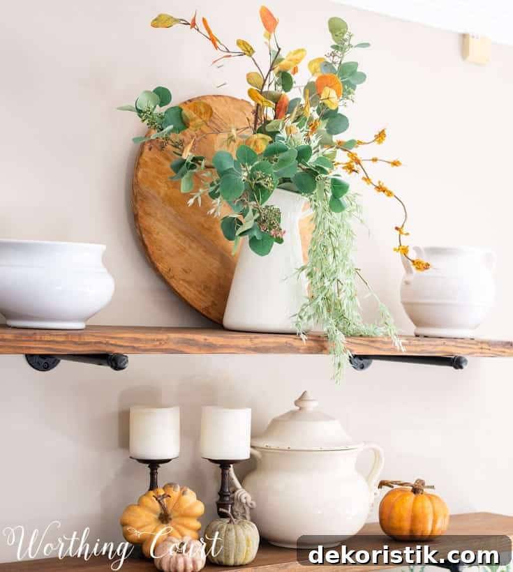
I kept the displays uncluttered and focused on texture and balance. A mix of real and artificial greenery adds visual interest and depth, while a few well-chosen accents—faux pumpkins in muted tones, wood elements, and simple ceramics—complete the look. Intentional spacing and repeating colors across the shelves help the arrangement read as a cohesive design rather than a collection of unrelated objects.
Practical Shelf Decorating Tips
- Start with a neutral backdrop: wood tones, white ceramics, or a simple vase help anchor seasonal pieces.
- Work in odd-numbered groupings—threes and fives tend to look balanced and natural on shelves.
- Vary scale to create interest: mix taller items like vases or candlesticks with smaller objects like pumpkins or mini frames.
- Layer greenery—combine a few sprigs of real eucalyptus with affordable faux stems to keep texture and longevity high.
- Repeat colors across the room to create cohesion between shelf decor and other elements like table centerpieces.
Muted Color Palette and Texture
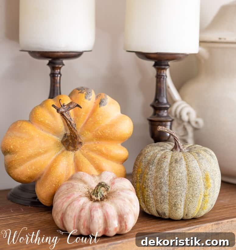
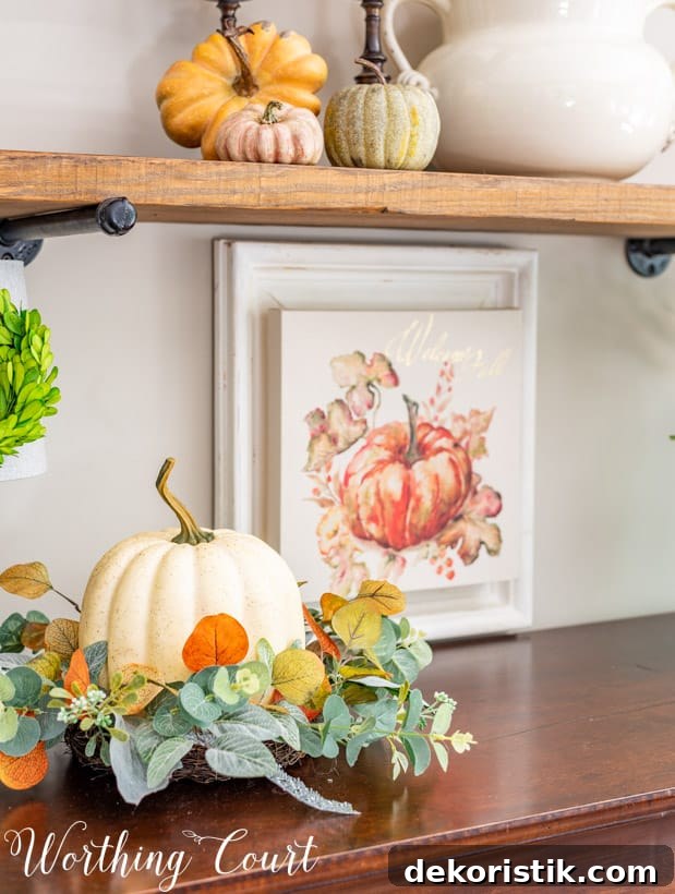
Choosing a muted palette—sage greens, dusty rusts, and soft mustard—lets you capture autumnal warmth without relying on bright orange. Textures are equally important: raffia, wood, candle wax, and leafy stems all contribute to a layered, cozy feel. Even a simple ring of faux foliage around a pumpkin or a sprig tucked into a vase can make a big difference in perceived richness.
Coordinating a Simple Table Centerpiece
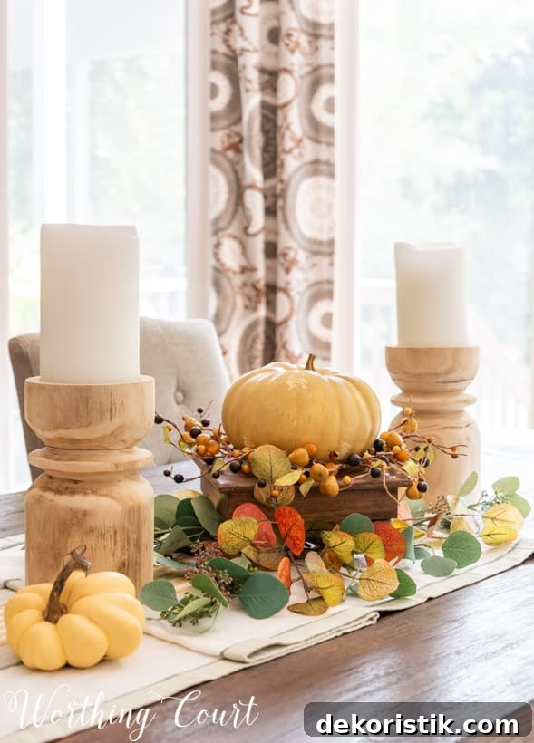
I carried the shelf colors over to the dining table with a simple centerpiece anchored by a runner. The table arrangement is intentionally low and layered: two chunky candlesticks, a decorative riser, and a creamy faux pumpkin sitting in a candle ring form the core. I finished the vignette by tucking the same eucalyptus sprigs used on the shelves into the base of the arrangement, tying the look together.
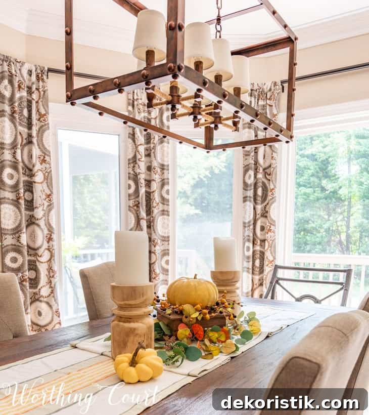
This centerpiece is quick to assemble and adaptable: swap in real pumpkins, different candle heights, or a change of foliage depending on what you have on hand. The key is balance—keep the centerpiece low enough for conversation across the table and repeat hues from the surrounding decor so the whole room feels intentional.
Final Thoughts
When I step into the family room from the foyer, the coordinated shelves and table centerpiece give me a quiet, cozy sense of fall without excess. With a simple color scheme, a focus on texture, and thoughtful placement of a few seasonal touches, you can achieve a warm autumn look that feels intentional and lived-in. Use what you already own, repeat colors throughout the space, and prioritize balance—small changes can create a big seasonal impact.