
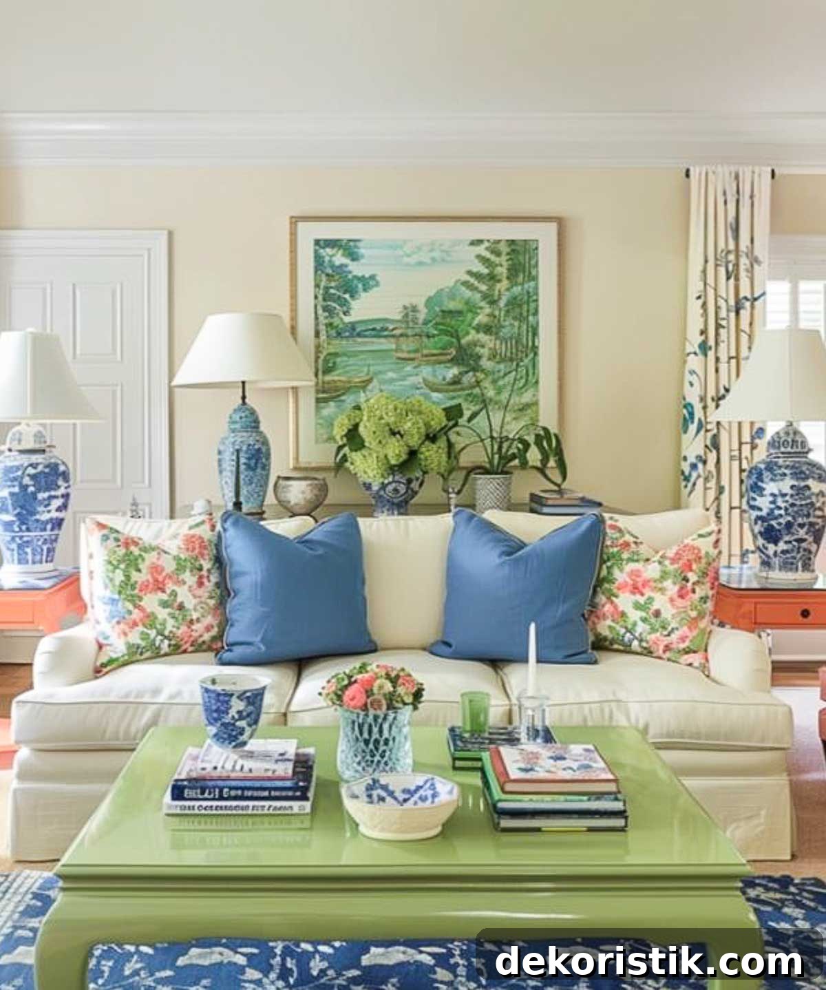
Choosing the right interior color palette can feel overwhelming, but with a few practical guidelines you can narrow your options and create a cohesive, beautiful home. This guide covers how to pick a base color, add complementary and accent tones, consider each room’s function, use online tools, and offers real-world examples and designer-inspired palettes to jump-start your planning.
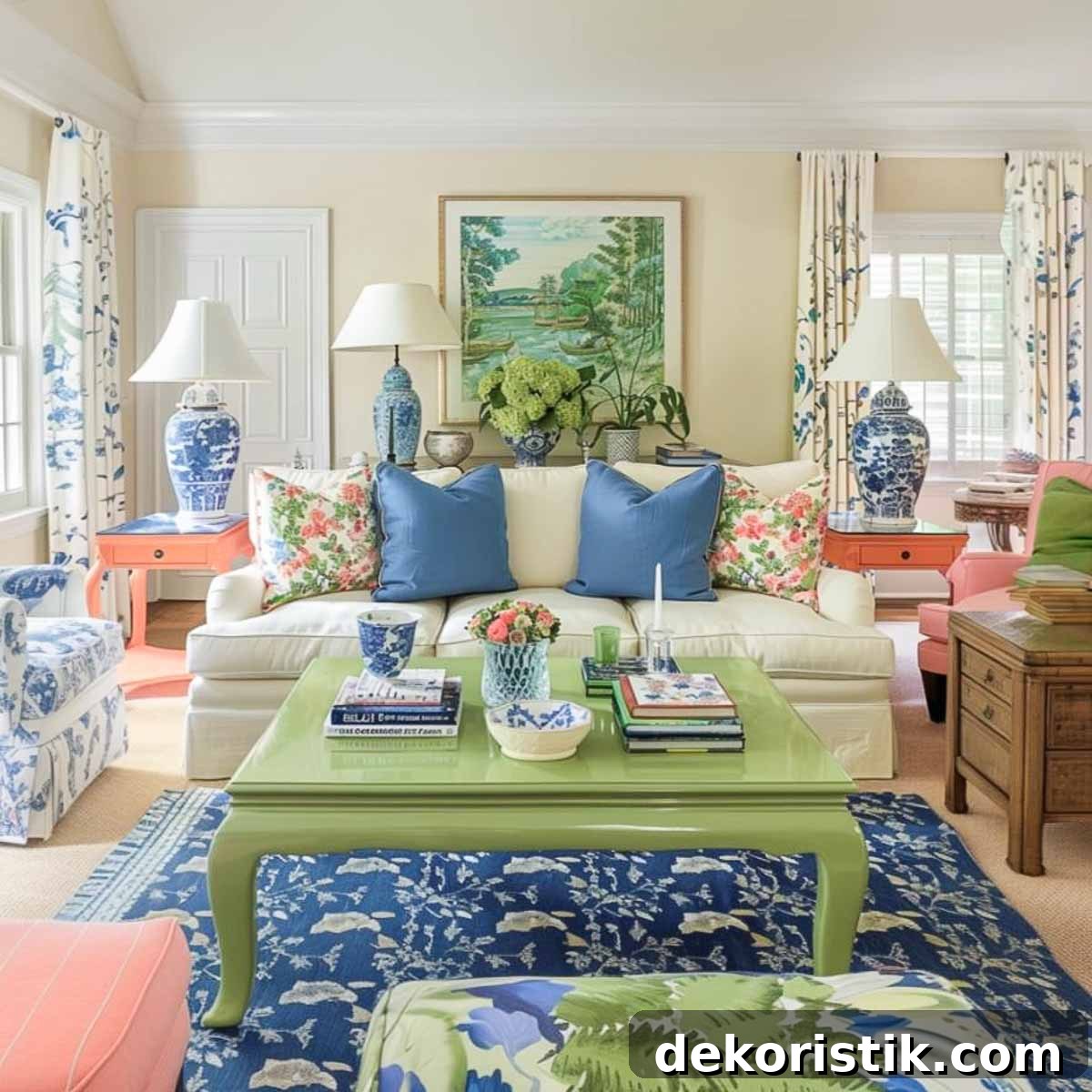
Color is one of the most powerful elements in interior design. The colors you choose influence mood, perceived room size, and how welcoming a space feels. A thoughtful palette will unify furniture, textiles, art, and decor; a mismatched scheme can make a room feel disjointed or unsettling.
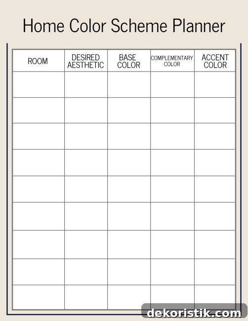
This article shares practical tips for selecting a home color scheme, highlights popular approaches used by well-known designers, and walks through a cohesive color story you can adapt for your own rooms. There’s also a printable Home Color Scheme Planner image included to help you take notes and bring your choices to the paint store.
Welcome to chapter 9 of the Simply Decorating Series, a free resource designed for the DIY decorator who wants clear, actionable steps to transform a house into a personal, livable home. If you’re starting the series, begin with chapter 1: How to Decorate a Room — Where to Start.
Note: When I talk about a home color scheme, I mean more than just paint on the walls. A complete color palette should include furniture, rugs, textiles, accessories, and artwork so that every element contributes to a unified look.
How to choose and combine colors for a perfect interior color scheme
Below are straightforward steps to build an interior palette that feels intentional and balanced.
Start with a Base Color
The base or dominant color sets the overall tone for your home and provides a foundation that will tie rooms together. Choose a base color that reflects the mood you want:
- Soft blues and greens for calm, restorative spaces
- Bold reds or oranges for energetic, lively rooms
- Neutrals like beige, gray, and white for versatility and easy coordination
Once the base color is selected, the rest of the palette — complementary and accent shades — should be built around it.
Select Complementary and Accent Colors
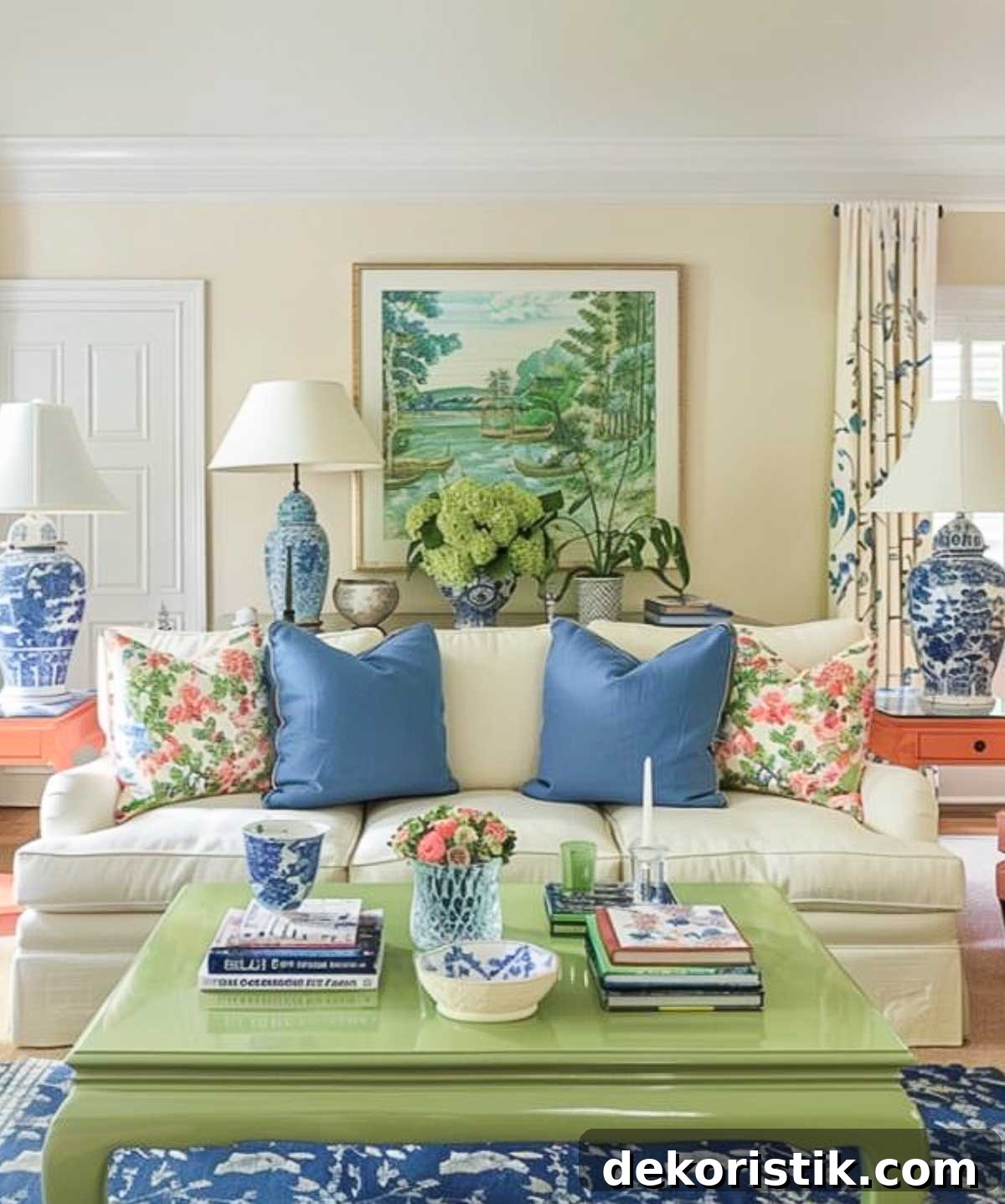
Complementary colors sit opposite each other on the color wheel and produce lively contrast — for example, blue and orange or yellow and purple. Accent colors are used sparingly to add interest: think cushions, artwork, lamps, and small decorative items.
A practical formula to keep balance is the 60-30-10 rule: 60% base, 30% complementary, and 10% accent. Bold hues work best paired with neutral backdrops, or introduced in smaller doses through accessories and feature walls.
Consider the Function of the Room
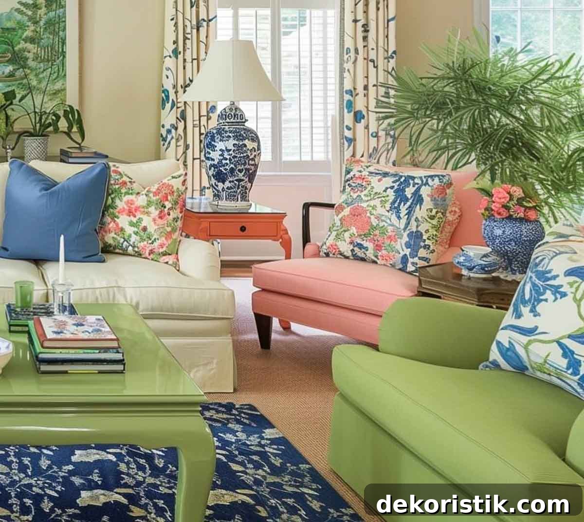
The purpose of each room should inform your color choices. Bedrooms typically benefit from soothing, muted tones; living rooms and social spaces can handle warmer, more inviting tones; and home offices often work well with colors that support focus and creativity.
To maintain flow through the house, keep a unifying neutral base across rooms and repeat one or two accent colors to link spaces visually.
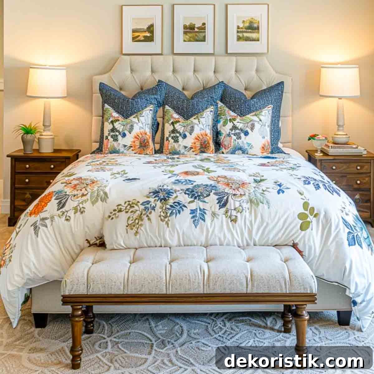
Using an online color palette generator
Color palette generators are useful tools for visualizing combinations and testing tones. They let you experiment quickly, lock favorite shades, and save palettes for later comparison. Popular tools include Coolors and Adobe Color — both offer intuitive interfaces for exploring palettes and extracting colors from images.
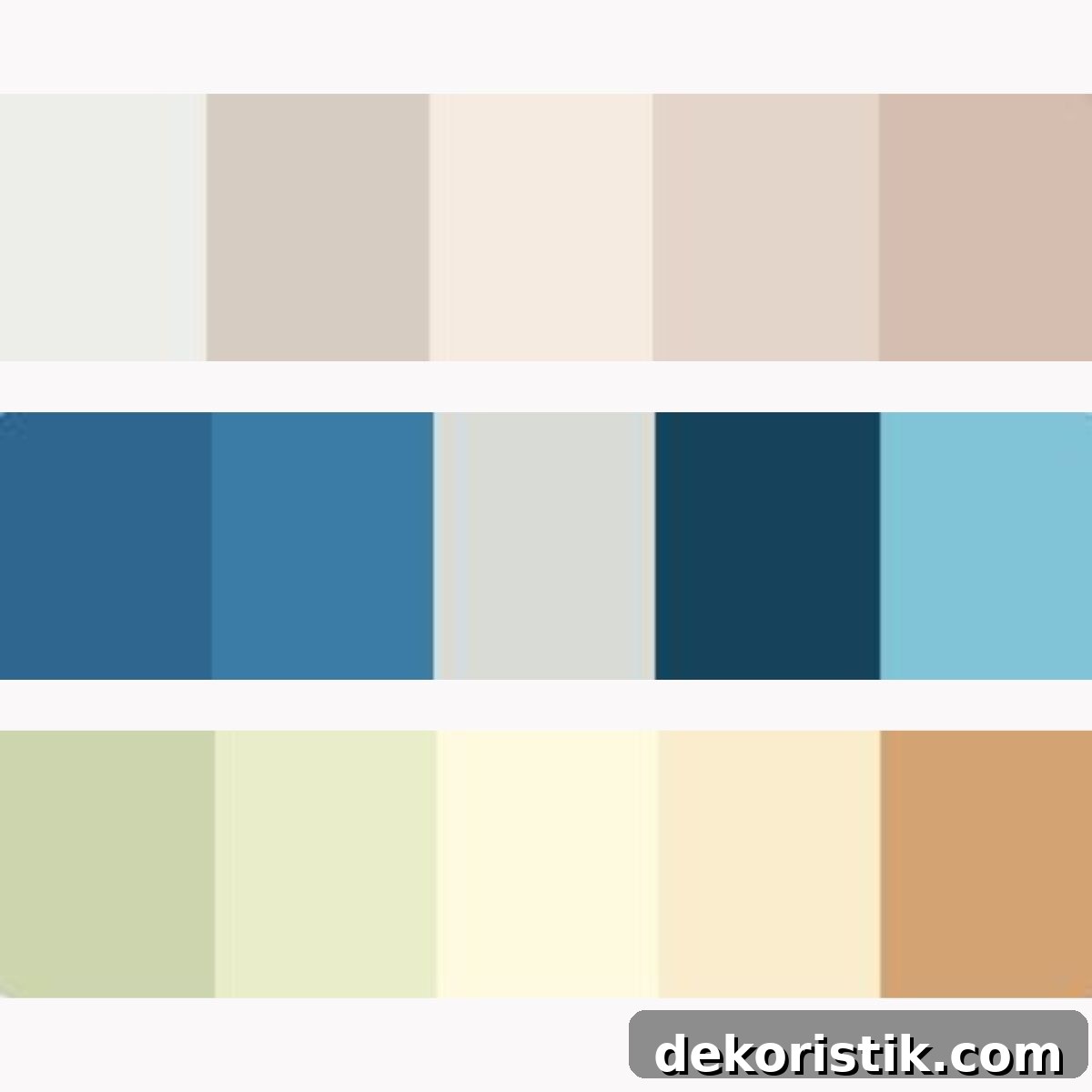
Tips for using these tools:
- Start by entering your chosen base color to see suggested complements and accents.
- Test different shade combinations and view them together in context.
- Save multiple palettes so you can compare options under different lighting and with your furnishings.
Color schemes that well-known designers love
If you need inspiration, look at the palettes favored by designers like James T. Farmer, Nancy Meyers, Bunny Williams, and Eric Ross. Their rooms demonstrate distinct approaches: natural, calming tones; crisp whites and coastal blues; rich saturated colors; and traditional, classic combinations. Use their work as a reference for tone and mood rather than a strict rulebook.
James T. Farmer
Farmer often blends soft, nature-inspired hues such as sage and sky blue with warm neutrals to create timeless, inviting interiors.
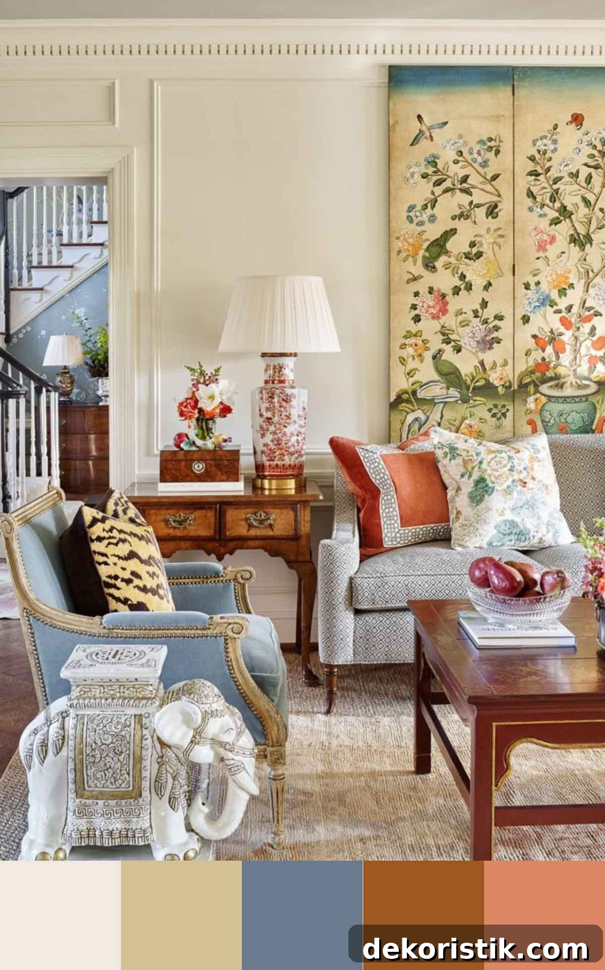
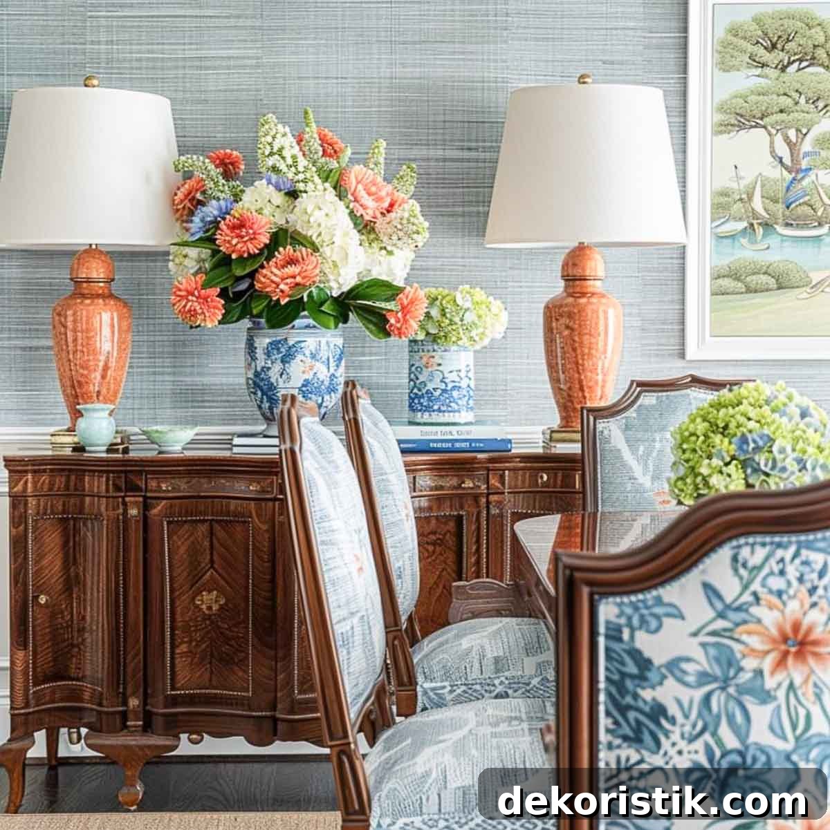
Nancy Meyers
Meyers’ palettes favor whites, creams, and soft beiges, often paired with blue-and-white accents for a fresh, airy, coastal feel.
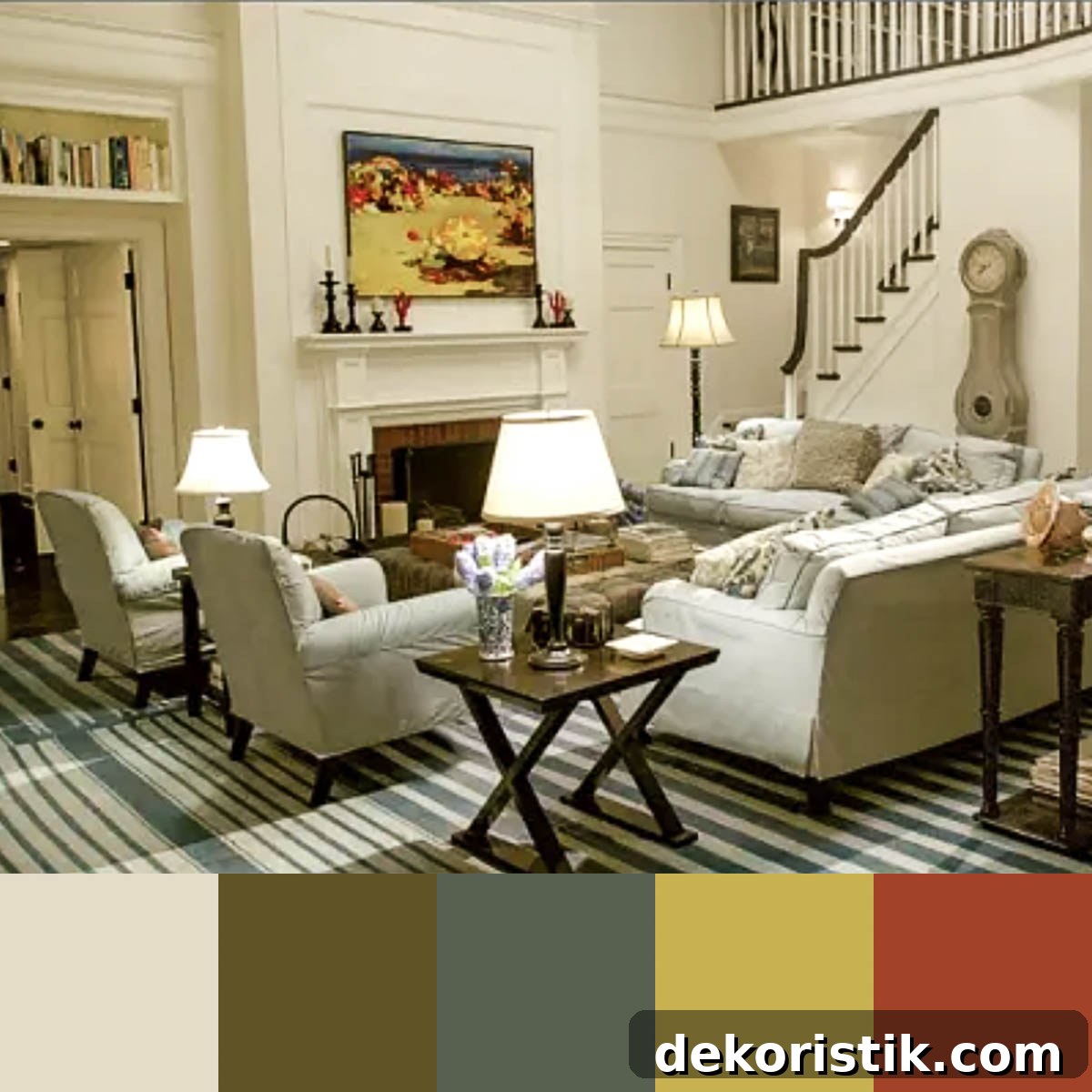
Bunny Williams
Williams often uses deep, saturated tones — rich browns, vibrant reds, and sophisticated greens — to create dramatic, warm interiors with a sense of luxury.
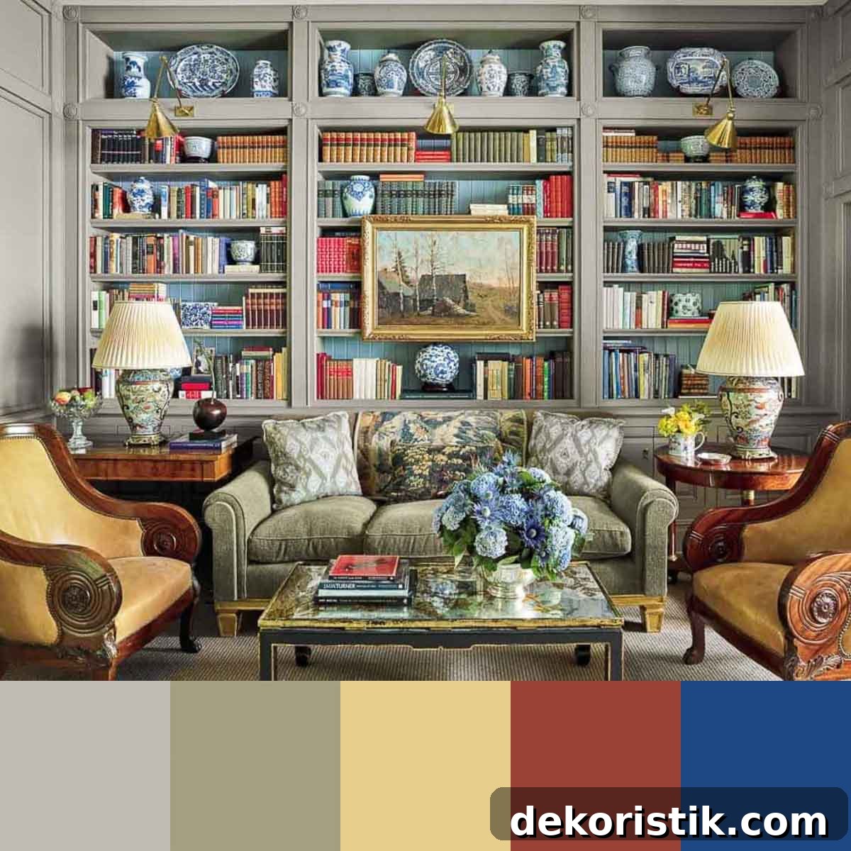
Eric Ross
Ross favors classic schemes that mix deep blues, warm yellows, and rich greens to achieve a timeless, elegant atmosphere influenced by historical palettes.
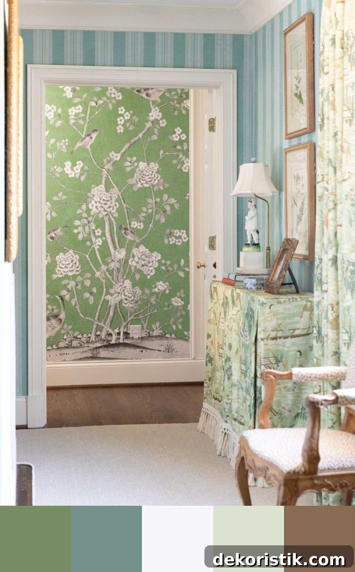
TIP: To adapt a designer’s palette to your home, identify the dominant color first, choose two to three supporting colors, balance bold tones with neutrals, and always test swatches in your rooms under real light.
Interior color schemes and their emotional impact
Colors influence emotions. Warm shades like red, orange, and yellow create energy and coziness but can be overwhelming in excess. Cool shades like blue, green, and purple promote relaxation and can make small rooms feel more open. Use this knowledge to match color to room function: lively hues for social spaces, calming hues for rest areas, and balanced tones for multi‑purpose rooms.
Practical application tips:
- Mix warm and cool tones for balance — for example, a cool blue bedroom warmed with earthy accessories.
- Match color intensity to room use: vibrant accents in social areas, muted tones in bedrooms.
- Layer different values of the same hue to add subtle depth without introducing more colors.
Always sample paint on your walls and view samples at different times of day. If you’re hesitant about a bold choice, try it in a small room or on an accent wall first.
A real-life example of a cohesive interior color scheme
Below are example palettes for common rooms, each following the 60-30-10 principle (base, complementary, accent). These illustrate how varied colors can still work together when a neutral base and complementary accents are repeated throughout the home.
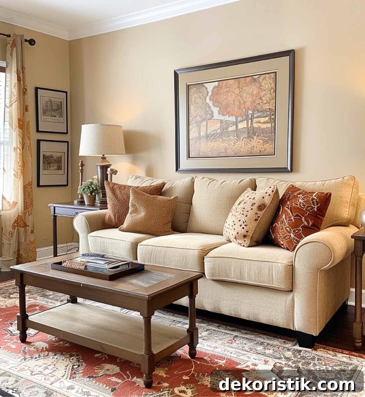
Living Spaces — welcoming and comfortable:
- Colors: Accessible Beige (Sherwin Williams); Hawthorne Yellow (Benjamin Moore); Red Earth (Farrow & Ball)
- Effect: A warm neutral base with sunny brightness and a rich red accent creates comfort and depth.
Home Offices — focused and energizing:
- Colors: Mindful Gray (Sherwin Williams); Soft Fern (Benjamin Moore); Charlotte’s Locks (Farrow & Ball)
- Effect: A neutral, focused base with natural green and a lively accent to spark creativity.
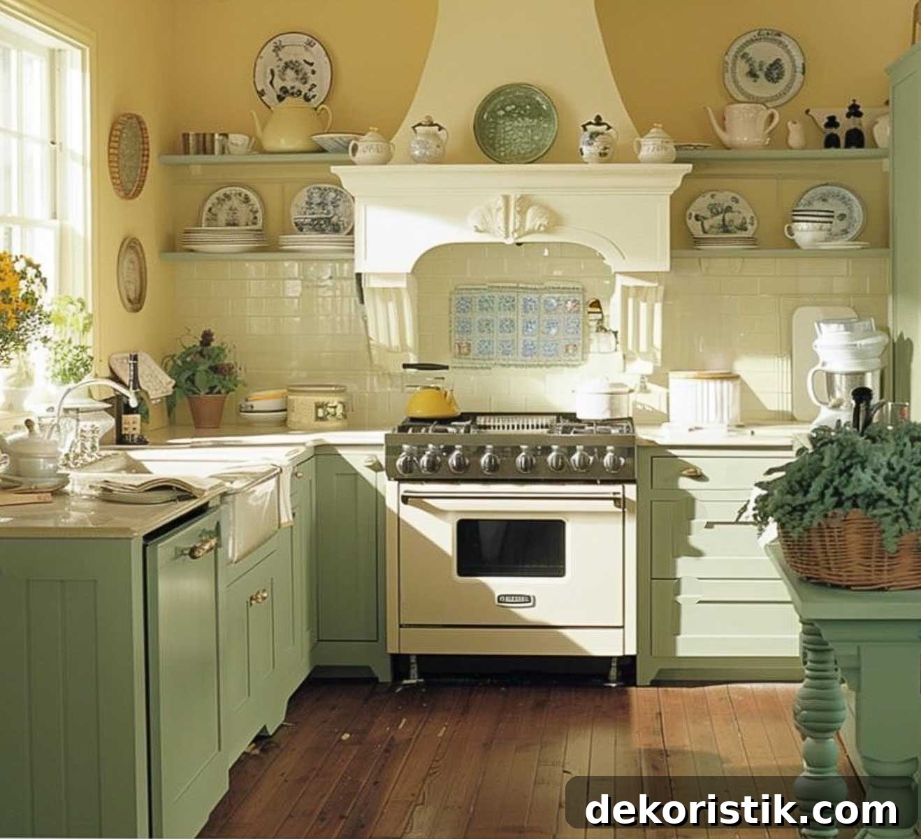
Kitchen and Dining Areas — appetizing and welcoming:
- Colors: Simply White (Benjamin Moore); Sage Green Light (Sherwin Williams); Yellowcake (Farrow & Ball)
- Effect: Clean white base, fresh green for a natural feel, and a cheerful yellow accent to lift mood.
Bedrooms — calm and restorative:
- Colors: Palladian Blue (Benjamin Moore); Sea Salt (Sherwin Williams); Calamine (Farrow & Ball)
- Effect: Soft, soothing tones that promote rest while offering gentle contrast.
These examples show how a consistent neutral base combined with repeated accent colors creates variety without losing unity. Each room feels distinct yet connected to the whole house.
Choosing an interior color scheme involves more than selecting paint — it’s about composing a coordinated palette that works with light, furniture, and your lifestyle. With these strategies and examples, you’re ready to plan a cohesive color story for your home.
Here is a printable Home Color Scheme Planner image to help you record choices and bring them to the paint store.
Next in the Simply Decorating series: how to makeover a living room when you change your style. For further inspiration, explore related topics such as “How to Fix a Room That Feels Off,” “How to Mix Decorating Styles,” “How to Decorate by Shopping Your Own House,” and “The Do’s and Don’ts of Home Decorating.”
- How to Fix a Room That Feels Off
- How to Mix Decorating Styles to Keep Your Home From Looking Boring
- How to Decorate by Shopping Your Own House
- The Do’s and Don’ts of Home Decorating: Basic Tips for Getting It Right
- The Secret to Layering Accessories Like a Pro
- Where to Start When Decorating a Room